New logo
A vehicle coming towards you
The new Transporta’m logo sums up what the app does: it brings public transport information to your pocket, so getting around by metro, tram, bus or train is easier for everyone.
Two rails drawing closer
The rails start beneath the vehicle and open out towards you. They are the path the information travels: from every operator and every line to your phone’s screen. After all, that is what Transporta’m means in Catalan: “take me”.
One vehicle for every mode
A windscreen, a destination sign and two headlights. It is no particular model: it can be a metro, a tram, a bus or a train, because the app brings them all together. We made it narrower and taller so it is recognisable even at the smallest home screen size.
Public transport in your pocket
Timetables, upcoming departures, delays and disruptions, clear and up to the minute. We want public transport to be more accessible: you shouldn’t need to know every operator or website to find out when yours is coming.
Colour and type
We keep our familiar red, now with a warmer gradient, and set the name in Inter Bold, the same typeface as the app and the website, from the family of grotesques used in public transport signage.
Logo versions
If you are writing about Transporta’m, you can use these versions. Please use them as they are, without changing their colours or proportions.

Icon
Download the PNG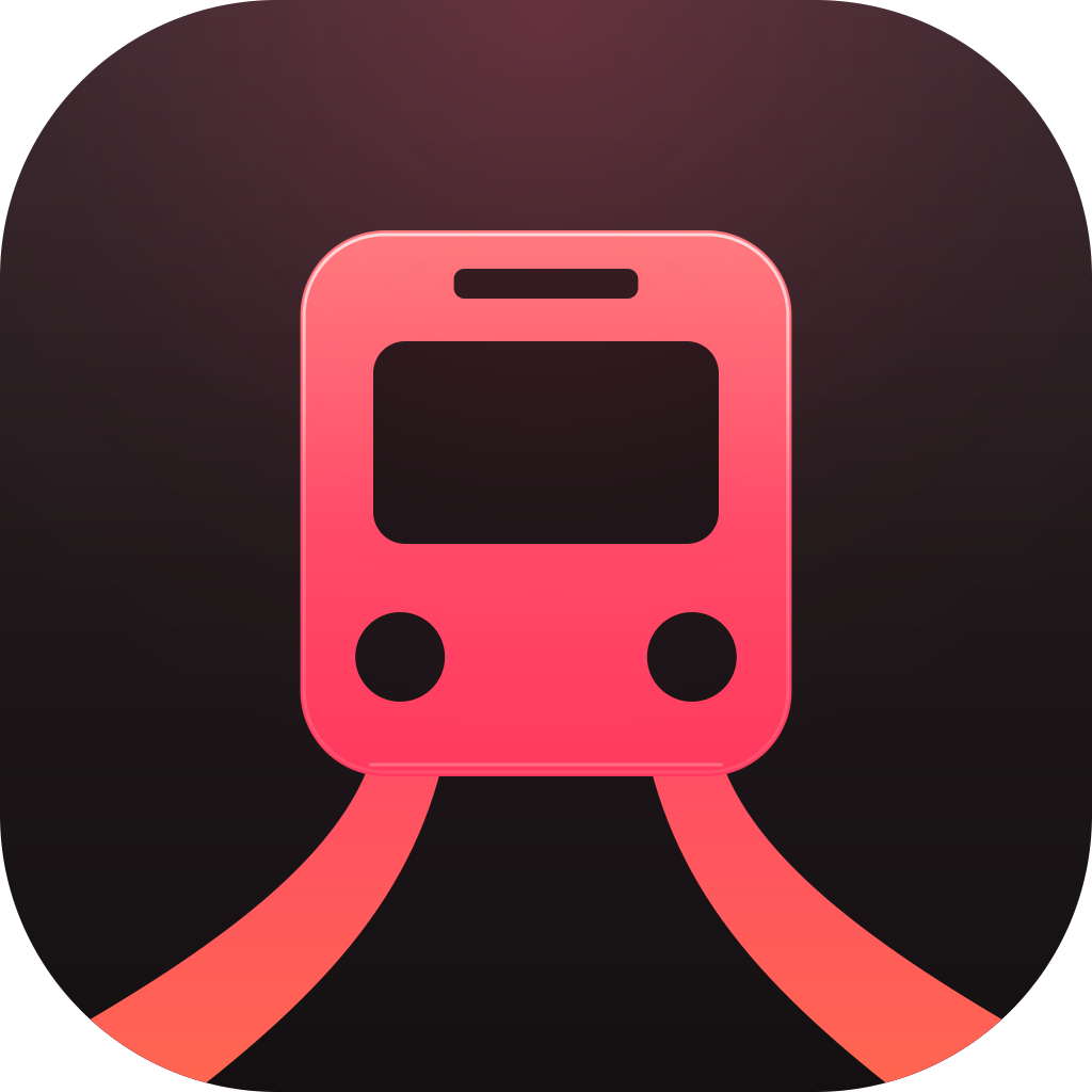
Dark icon
Download the PNG
Flat icon
Download the PNG
One-colour icon
Download the PNG
Logo
Download the PNG
Logo for dark backgrounds
Download the PNG